 |
 |
 |
About Line Graph Reports
SiteScope can display monitor data in line graph format. Unlike bar graphs, line graphs can show multiple items on a single graph as well as individual measurements.
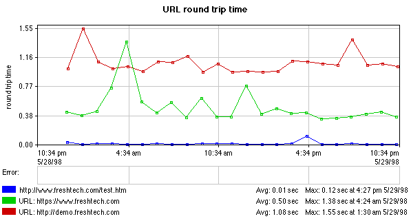
Line graphs can be created in a Quick Report, or can be set to run as part of scheduled report, just like bar graphs. The line graph shows the type of measurement, with the vertical scale on the far left and the time scale at the bottom. When the line graph is displayed as small squares connected by lines, each square represents an individual sample (see figure 1 for an example). Monitors that are sampling less often have more widely separated samples than those that sample more often.
The color legend at the bottom of each graph shows the name of the monitor represented by that color and the average and maximum values for that monitor over the graphed time period.
Line graph reports are displayed in SIteScope using a Java applet. While all browsers may not be able print these line graphs directly from the browser window, you can click (left-select) the image in the browser window and save the graph image to disk as a JPEG file. You can then embed the image into another application.
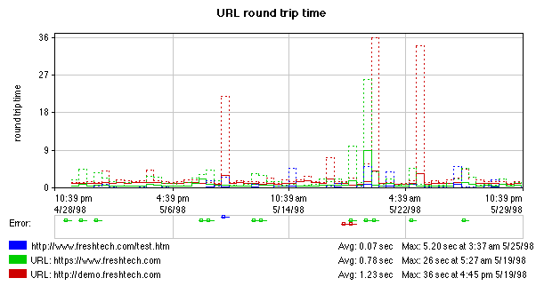
The Error section (see figure 2 for an example) shows the period of time that the monitor was in error, and thus, has no value for display in the main graph area. Error bars are color coded to match the monitors they represent.
When there are too many samples to show separately on a graph, such as on the monthly graph shown in figure 2, the line chart displays a modified bar chart. In this case, the height of the solid colored lines represents an average of several values for each interval on the graph. The dashed lines represent the maximum values for each interval on the chart.
Line Graph Report Types
There are four types of line graphs. The type controls the grouping of the monitors and the data.
- line graph - one graph per measurement
-
This type of graph shows a single type of measurement for a single
monitor, much like the bar chart. This creates a very clear picture
of a monitor's values over time.
- line graph - one graph per monitor
-
This type of graph puts all similar measurements for a given
monitor on a single graph. You can use this type of graph to see
relationships between various measurements for a given monitor. For
example, the URL Sequence monitor shows the total time to execute
all of the steps in the sequence as well as the time for each
individual step all on the same graph.
- line graph - one graph per type of measurement
-
This type of graph groups similar measurements from multiple
monitors on a single graph. The graphs shown in figures
1 and 2 are examples of this type of
graph. You can use this type of line graph to explore
relationships between monitors. For example, you can graph the
results of URL monitors to show how much slower a secure URL is
than a normal http URL.
- line graph - one graph for all measurements
-
combines the previous two types of graphs to put all similar
measurements on a single graph, across multiple monitors. This is
useful for viewing some kinds of relationships, but can become too
dense to be useful in some instances.

Copyright © 2004 Mercury Interactive Corporation.
All rights reserved.
|
|
|