 |
 |
 |
Reading Management Reports
SiteScope management reports provide status information for one or more monitors over a given period of time. When you add a management report you specify when or how often you want SiteScope to automatically generate the report. With a Quick Report you can scale the report time period to focus on particular events or time periods. The reports are generated from current monitor readings and previous readings recorded in the SiteScope log data
There are a number of ways that you can access management reports. To view custom management reports that you have created and the SiteScope default management reports, click the Report button on the navigation bar from anywhere within SiteScope. This brings up the Management Reports page. click the name of the monitor or monitor group that you want to view to bring up the Management Report Summary page. The dated links in the left hand column of the summary table are links to the applicable reports for the date indicated.
To view the default report for an individual monitor, go to the group page for that monitor and click the monitor's name in the monitor table. This generates a management report for the individual monitor using the default report format. The time period of this report will depend on how often the subject monitor runs. Generally, this report will display the data from the most recent 20 monitor runs. This means that the report time period for monitors that run frequently will be smaller than the report time period for monitors that run less frequently. For example, if a monitor is set to run every 10 minutes, the default report for that monitor will cover a period of 200 minutes (10 minutes x 20 samples). For a monitor running once every hour, the report will cover a period of 20 hours (60 minutes x 20 samples).
You can generate a management report at a time other than the scheduled time by going to the SiteScope Management Reports page. On the Management Reports table, click the named link in the Report column of the table for the report you want to generate. This takes you to the Management Report page for that group or monitor. Choose the Generate button at the bottom of the page to generate an update to that report.
Another way to generate a report is to use the Quick management report link Management Report page. You use the Quick management report to select monitors and groups as well as a number of other parameters to define a one-time management report. It is important to note that the selections you make for a Quick Management Report are not saved for future use.
The Management Report Format
Each type of SiteScope management report includes several optional report sections. These are:
- Uptime and Readings
- Time in Error Summary
- Readings in Graphical Format
- Readings in Table Format
- Error Listing
- Alert Listing
By default, five sections are enabled for every report. The content of each report will reflect selections made when the report was defined in the Add Management Report page. Each of the report sections may be enabled or disabled by checking/un-checking check boxes on the Update Management Reports form.
Below are descriptions of the different report sections including some example graphs and tables. For additional explanation of how to interpret management reports read Interpreting SiteScope Management Reports
Uptime and Measurements
The first section contains two tables that display an uptime summary and a reading summary for the selected monitor(s). The uptime summary contains information about what percentage of the reported time period the monitor(s) returned an OK, error or warning status, as well as what the most current status is. The reading summary shows what parameter is being measured (that is, round trip time), as well as the maximum, average, and last reading for the time period being reported on.
In terms of eBusiness performance monitoring, the uptime summary is of particular interest. The following explains how the uptime calculation is made.
SiteScope monitors are not run continuously. In fact, given the principles of network communication, it is a misconception to consider a networked exchange of information as being continuous. When a monitor is run, a request is sent and a response is received. The response is recorded as the result of the monitor run with the status (for example, good, warning, or error) is determined based on the parameters set for that monitor. These discreet monitor results are used to extrapolate the performance of the system being monitored.
Uptime percentage is calculated by adding the intervals for "good" readings found within the report period and dividing the sum by the sum of the period intervals. The example in Table A illustrates the calculation of uptime. This example is for a report period of two hours from 8:00 to 10:00. The subject monitor is set to run every ten minutes. It is important to note that the monitor ran at ten minute intervals but that these do not match the ten minute clock intervals that would result from dividing the two hour period (8:00 to 10:00) into ten minute intervals. The monitor reading prior to the start of the report period is included as well as the monitor reading immediately following the report period for context.
Table A. Example Uptime Calculation for a Report Period 8:00 - 10:00
Monitor Run |
Status |
Comment |
"Good" Count |
"Error" Count |
"Warning" Count |
Report Period |
|
|---|---|---|---|---|---|---|---|
| 7:52 | good | (outside of report period) | |||||
|
8:00 |
start of report period | ||||||
| 8:02 | good | start of report data | 0 | 0 | 0 | 0 | |
| 8:12 | good | first value counted | 10 | 0 | 0 | 10 | |
| 8:22 | good | second value counted | 20 | 0 | 0 | 20 | |
| 8:32 | good | etc. | 30 | 0 | 0 | 30 | |
| 8:42 | error | first error value | 30 | 10 | 0 | 40 | |
| 8:52 | good | 40 | 10 | 0 | 50 | ||
| 9:02 | good | 50 | 10 | 0 | 60 | ||
| 9:12 | no data | no values incremented | 50 | 10 | 0 | 60 | |
| 9:22 | no data | no values incremented | 50 | 10 | 0 | 60 | |
| 9:32 | error | 50 | 20 | 0 | 70 | ||
| 9:42 | good | 60 | 20 | 0 | 80 | ||
| 9:52 | good | end of report data | 70 | 20 | 0 | 90 | |
|
10:00 |
end of report period | ||||||
| 10:02 | good | (outside of report period) | |||||
For the example in the table above there are twelve (12) monitor readings found within the report period of 8:00 to 10:00. Of these twelve, the first reading is used to mark the beginning of the report time period (the reading at 8:02). The status counters and total period counters are set to zero for this point. The status of the second reading is extrapolated backward as the status value for the first interval. This pattern continues through each of the data values with the appropriate status count (that is, good, error, or warning) being incremented accordingly. Where a status of "no data" is found, none of the counters are incremented, including the total report time counter. In the example in Table A, two of the twelve data points are not counted because of a status of "no data". This leaves nine (9) intervals that are used in the calculation of uptime. The uptime calculation then gives the following:
Uptime% = Good Count / Report Period = 70 / 90 = 77.778%
Error% = Error Count / Report Period = 20 / 90 = 22.222%
Warning% = Warning Count / Report Period = 0 / 90 = 0.000%
The Measurements Summary section gives the average of the results for report period for each of the monitors included in the report. It also lists the maximum value recorded during the period.
Uptime and Measurements
The Time in Error Summary is the total amount of time that the monitor was in error during the reporting period. The calculation methods described above apply to the Time in Error Summary.
Readings in Graphical Format
The third section of the report displays all the readings taken during the reported time period in either a bar graph or a linear graph format. This same information is also displayed in a tabular format in the third section of the report.
Bar Graph Format
In the bar graph view you will see a graph of the data returned by the monitor which will look something like the following examples:
Figure 1. Example of a Network Interface monitor that returns varied readings.
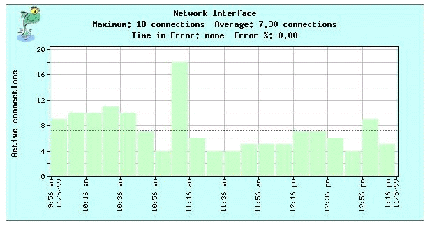
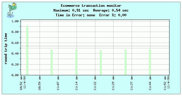
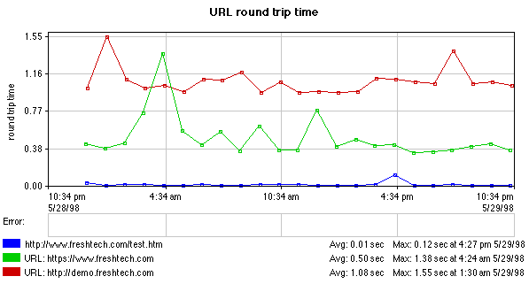
Figure 2. Sample Bar Graph for E-Commerce Transaction Monitor
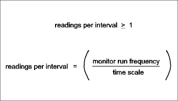
Time is represented along the horizontal axis of the graphs. This axis is subdivided into sample intervals. Each bar represents the monitor results recorded during that fraction of the total reporting time period. This sample interval or width of the bar is variable and depends upon the total length of time for which the data is being reported as well as any time scale that you chose for the report. If you didn't indicate a time scale when you created the report, SiteScope will automatically choose a scale based upon the number of readings for the monitor over the entire report period. In many cases the report period will be subdivided into approximately 40 sample intervals. Depending on the time period of the report and the number of monitor readings recorded for the period, there may be sample intervals with no data or "gaps".
You can change the granularity of a report by adjusting the time scale for the report under the Advanced Option section of the report setup page. This can be used to reduce the number of sample intervals used for the report.
Report gaps or unevenly combined (averaged) values in the report can be caused by one of several things. These include:
- The report time period and time scale are too narrow for the monitor run interval. For example, selecting a report time period of one day (24 hours) for a monitor that runs every 2 hours. Selecting a time scale of one hour intervals results in a report with gaps between bars. The monitor record only 10 readings for the report interval although the report was constructed with 24 sample intervals.
- Multiple monitors with different run frequencies are included in the same report. The unless the time scale is explicitly set to match the run rate of the least frequently run monitor, the time scale will be set to match the most frequently run monitor. For example, a report on server loading includes a number of CPU and memory monitors. Most of the monitors are set to run every minute but some of the memory monitors are set to run every two minutes. When displayed on a single report, the once-a-minute monitors would display as adjacent bars whereas the once-every-two-minute memory monitors would display with gaps between adjacent bars.
- A schedule is in effect for the monitor. This results in intervals when the monitor is not running and therefore no data is available. Normally this will be evident on reports that cover more than one day. Report periods of one day or less may show a gap for the interval that the subject monitor was not running.
- The report time scale matches monitor run interval very closely but there is an offset for some monitor readings due to process loading. This may be the case when there are seemingly random gaps in an otherwise continuous graph. For example, in an quick report for a monitor that runs every hour. the report period is selected as one day (24 hours) and the time scale is selected as every hour. This will create 24 time buckets (sample intervals) representing the twenty-four hours. During the period normal monitoring queuing and report generation delayed the monitor run while a scheduled monthly report is generated. Due to a close match between the sample interval boundaries and the time that the monitor was normally run, the delay was enough to move the resulting reading into an adjacent sample interval. The report then shows two runs in one sample interval and a gap in the adjacent sample interval slot due to the processing delay.
The formula for adjusting report time period and time scale to close gaps is as follows:
The value of the monitor readings is plotted on the vertical axis. If you didn't indicate a vertical scale when you created the report, SiteScope will scale the vertical scale based on the maximum reading for the period.
The height of each bar in the graph represents the monitor's reading during that interval of the report period. If the monitor ran more than once during a sample interval, the height of the colored bar represents the average the multiple readings in that interval. The color of the bar represents the worst status of the readings for that interval. For example, if you select a report period of one day (24 hours) for a monitor that runs once every minute, the report will encompass approximately 1440 monitor readings. Rather than display each of these readings as an individual bar, the readings are averaged into sample intervals based on the time scale. For this example, if a time scale of one hour is selected, the report period is subdivided into 24 sample intervals with each bar representing the average of the 60 monitor readings in that interval. The color of the bar is determined by the worst status recorded for the interval. For example, if one of the 60 readings in a given interval is reported as in error the bar will be red, even if the other 59 readings are reported as good. A gray bar will be displayed behind the colored bar for the maximum reading in that interval.
The color of the bar indicates what status for the interval, with red representing an error status, yellow a warning status, green an OK status, and blue for a disabled status. Intervals may have a gray colored portion showing above (behind) the colored bar. This means that there was more than one monitor reading for that sample interval and the gray bar represents the peak or maximum reading during that sample interval. If the peak or maximum reading is the same as the average status, the gray bar will not be visible. Where no bar is shown means that no reading was found for that period of time.
The title block of each bar graph may contain the following additional historical information:
- Maximum
- This is the highest reading returned during the entire reporting period.
- Average
- This is the average of all of the readings returned during the entire reporting period.
- Time In Error
- This is the total amount of time that the monitor was in error during the reporting period.
- Error %
- This is the percent of time that the monitor was in error during the reporting period.
Line Graph Format
Line graph reports are shown using a Java applet. Unlike bar graphs, line graphs can show multiple items or monitors on a single graph as well as individual measurements. They cannot, however, be printed directly from some browsers. They can be saved separately as jpeg files from the browser window.
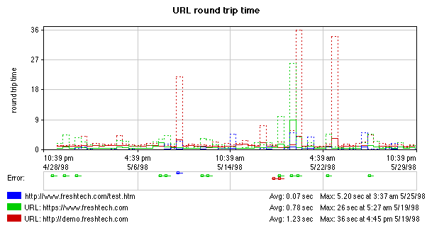
Figure 3. Sample Line Graph for a Server Monitor
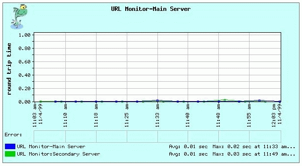
Line graphs can be created in a Quick Report, or can be part of a scheduled management report, just like bar graphs. Line graphs are not generated for the default reports that are triggered from the monitor name link on the Monitor Detail page.
The line graph shows the type of measurement, with the vertical scale on the far left and the time scale at the bottom. When the line graph is displayed as small squares connected by lines, each square represents an individual sample (see figure 1). Monitors that are sampling less often have more widely separated samples than those that sample more often.
As with the bar graph format, the title block of the line graph contains includes the maximum reading, average reading, Time in Error, and error percentage for the period. If the readings for more than one monitor are displayed on a single graph, the color legend at the bottom of each graph shows the name of the monitor represented by that color and the average and maximum values for that monitor over the graphed time period.
The Error section (see figure 2 for an example) shows the period of time that the monitor was in error, and thus, has no value for display in the main graph area. Error bars are color coded to match the monitors they represent.
When there are too many samples to show separately on a graph, such as on the monthly graph shown in figure 2, the line chart displays a modified bar chart. In this case, the height of the solid colored lines represents an average of several values for each interval on the graph. The dashed lines represent the maximum values for each interval on the chart.
Readings in Table Format
The historical information of monitor readings is available in a tabular format in the third section of the report. An example of this section is shown below:
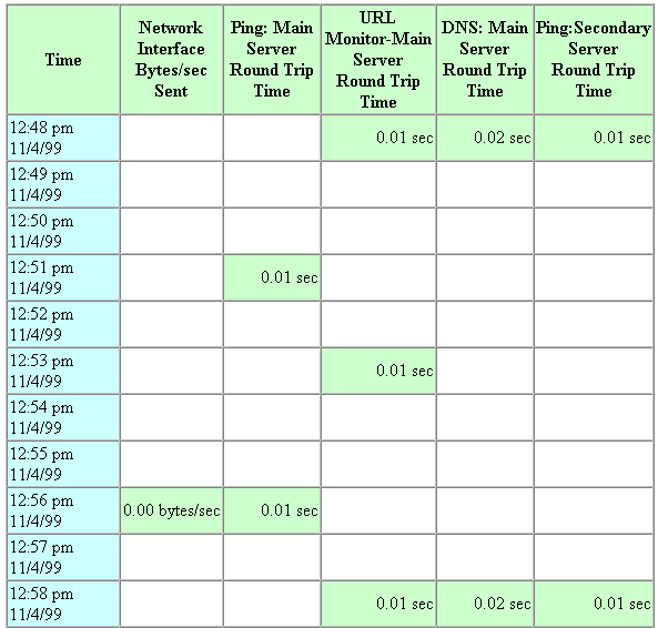
As in the graphical view, the total reporting period is divided into equal fractions of the total reporting period. If you chose a specific time increment using the scale option, that will be used; otherwise SiteScope will choose an appropriate scale based on the number of readings taken over the course of the entire reporting period.
The values reported for each time period may or may not reflect actual values returned by the monitor. If only one reading was taken during that segment of time, the value listed will reflect that reading; otherwise, the value will be an average of all readings taken during that time. If the monitor returns only an OK or fail status, the value will reflect the "worst" status reported during that segment of time.
There may be times that you see blank entries. This indicates that no readings were available for that portion of the reporting period. This does not mean that the monitor wasn't running correctly - only that the monitor was running less frequently than the length of the time increments on the management report.
Error Listing
The fifth section of the report contains a list of up to the last 100 errors generated for the monitors included in the report. The Error Listing section displays the time that each error was detected by SiteScope. The name of the monitor that was in error and the status are also listed. This allows you to see at a glance how the monitors described in this report performed during the reported time period. If no errors were generated, that will be indicated as well.
Alert Listing
The Alert Listing details the Alerts that were generated for the monitor(s) during the reported time period. In addition to the time the alert was generated, you can also see what type of alert was generated (pager, e-mail, SNMP, or script), the message that was sent, the name of the monitor and the group to which it belongs.
it is easy to look at the Error Listing and compare it with the Alert listing to see if alerts were generated appropriately. If an error was detected but no alert was generated, it is very likely that you do not have your alerts defined properly. Go back and check them out.

Copyright © 2004 Mercury Interactive Corporation.
All rights reserved.
|
|
|